

Table of Contents
- RAW Logo Origins: The Birth of an Iconic Brand Identity
- Evolution of the RAW Logo Through the Years
- Key Design Elements and Symbolism in RAW Logos
- Authenticity Markers: How to Spot Genuine RAW Logos
- Product-Specific Variations of the RAW Logo
- Brand Identity and Future Direction of RAW Visual Elements
Exploring the Evolution of the RAW Logo: Past and Present Designs
nnThe RAW logo has become one of the most recognizable symbols in the rolling paper industry, representing quality, authenticity, and a commitment to natural products. Since its inception, this iconic emblem has undergone several transformations while maintaining its core identity. Understanding the evolution of the RAW logo provides insights into the brand's growth and its strategic approach to visual branding.
nnRAW Logo Origins: The Birth of an Iconic Brand Identity
nnWhen RAW first entered the market, its logo was designed to reflect the brand's fundamental philosophy: unrefined, unbleached, and natural. The original RAW logo featured a simple, rustic typeface with the three letters prominently displayed. This minimalist approach aligned perfectly with the brand's commitment to providing pure, additive-free rolling papers.
nnThe initial design established RAW as a distinct player in an industry where chemical processing and bleaching were common practices. According to our research into RAW's authenticity, this original branding decision was integral to communicating the product's natural benefits to consumers.
nnEvolution of the RAW Logo Through the Years
nnEarly Iterations (2005-2010)
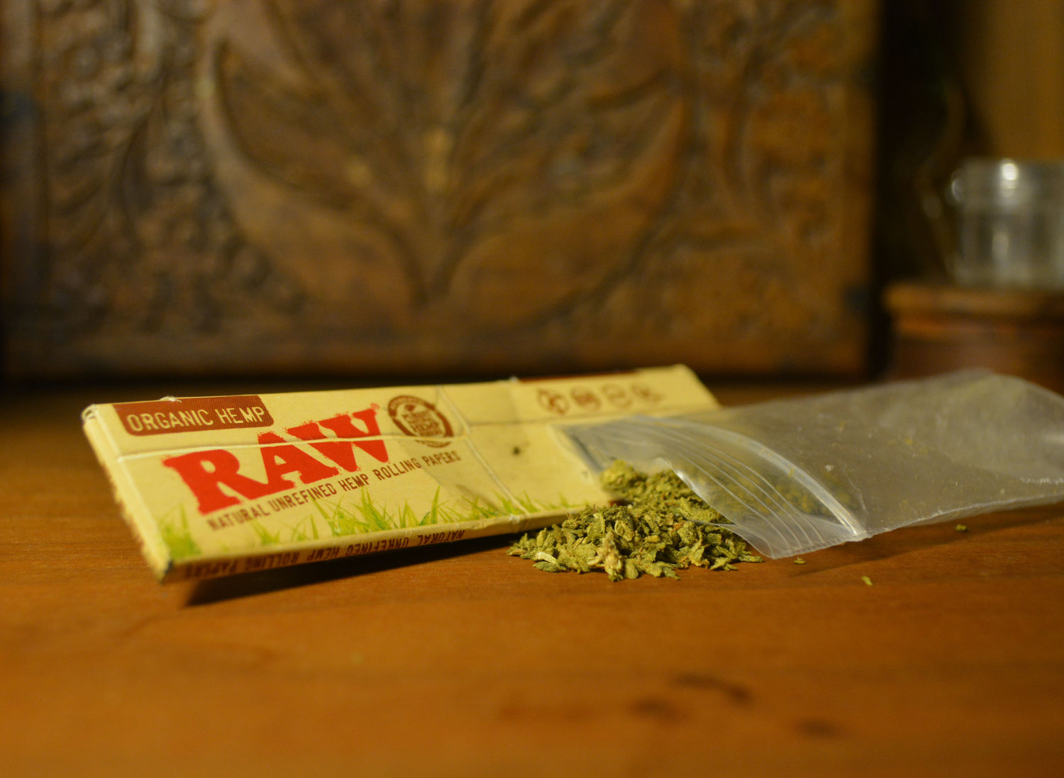
nnThe early RAW logo featured a straightforward, all-caps presentation of "RAW" with minimal embellishment. During this period, the logo appeared primarily on rolling paper booklets with a color scheme that emphasized earthy, natural tones. The packaging incorporated the unrefined brown color that would become synonymous with the brand.
nnMiddle Period (2010-2015)
nnAs RAW expanded its product line beyond basic rolling papers, the logo began to evolve. During this period, the brand introduced subtle refinements to the typeface while maintaining its recognizable form. The old RAW logo from this era started incorporating the "RAW" text within a circular emblem on some products, particularly premium lines.
nnContemporary Design (2015-Present)
nnThe modern RAW logo has embraced a more sophisticated design approach while staying true to its roots. The current iteration features a slightly more polished typeface with distinctive serifs and spacing. This evolution reflects the brand's growth into a global entity while preserving the authentic, natural aesthetic that loyal customers associate with RAW products.
nnKey Design Elements and Symbolism in RAW Logos
nnThe RAW logo incorporates several consistent design elements that have become hallmarks of the brand's visual identity:
nn- n
- Typography: The distinctive typeface used for "RAW" features slightly irregular lettering that reinforces the natural, handcrafted aesthetic n
- Color palette: Earthy browns and tans dominate, reflecting the unbleached paper products n
- Circular elements: Many RAW logos incorporate circular borders or backgrounds, symbolizing completeness and natural cycles n
- Watermarks and texture: Subtle background patterns that mimic natural fibers appear in many logo variations n
As we've observed while sourcing various premium rolling products alongside our RAW offerings, these design elements help distinguish authentic RAW products from competitors and counterfeits in the marketplace.
nnAuthenticity Markers: How to Spot Genuine RAW Logos
nnWith RAW's popularity has come an unfortunate rise in counterfeit products bearing fake RAW logos. Authentic RAW logos contain several security features designed to help consumers identify genuine products:
nnMicrotext and Hidden Elements
nnGenuine RAW logos often incorporate tiny text or symbols visible only under magnification. These microtext elements are changed periodically and serve as an authentication feature that counterfeiters typically miss or cannot reproduce accurately.
nnPrecision Printing and Consistent Coloration
nnAuthentic RAW logos demonstrate consistent color reproduction and precise printing across all elements. Counterfeit logos often show color inconsistencies, blurry edges, or printing misalignments that aren't present in genuine products.
nnOur guide on RAW product authenticity provides detailed information on how to verify genuine RAW items through their logo characteristics and other identifying features.
nnProduct-Specific Variations of the RAW Logo
nnThe RAW logo has been adapted across various product lines while maintaining core design consistency:
nnRAW Black Logo Variation
nnThe RAW Black line features a distinctive variation of the standard logo, incorporating darker elements and premium visual cues to signify the ultra-thin, luxury papers in this collection. As explored in our analysis of RAW Black products, this logo variation maintains the RAW identity while communicating premium positioning.
nnRAW Accessories Logo Applications
nnOn accessories like grinders, rolling machines, and storage containers, the RAW logo often appears in embossed or debossed formats. These three-dimensional applications of the logo add tactile elements to the brand experience while maintaining visual consistency.
nnSpecial Edition and Collaborative Logos
nnFor limited releases and collaborations, RAW has created special variations of its logo that incorporate elements from partner brands or unique design motifs. These special edition RAW logos become collectors' items while reinforcing the core brand identity.
nnThe versatility of the RAW logo across different product categories demonstrates the brand's strong visual foundation and adaptable design system.
nnBrand Identity and Future Direction of RAW Visual Elements
nnAs RAW continues to innovate and expand its product offerings, its logo will likely undergo further refinements while preserving the authentic character that consumers recognize and trust. Recent trends suggest the brand is moving toward a more streamlined, versatile logo system that works effectively across digital platforms while maintaining its distinctive analog charm.
nnThe future evolution of RAW logos will likely balance heritage elements with contemporary design principles, ensuring the brand remains relevant while honoring its origins. As seen in RAW's approach to product innovation, the company values progress that respects tradition, a philosophy that will surely guide its visual identity development.
nnFor collectors and enthusiasts, the various iterations of RAW logos represent not just brand identifiers but artifacts of cultural significance in the evolving landscape of smoking accessories. Whether displayed on classic paper booklets or modern sustainable packaging, the RAW logo continues to symbolize quality, authenticity, and natural materials in an industry increasingly focused on these values.